

Simplicity is often misunderstood. When people describe a tool as simple, they usually mean it feels light, intuitive, and easy to use. What they rarely see is the complexity that makes that simplicity possible. Behind every calm interface and frictionless experience lies a deliberate architecture designed to remove noise rather than add features. LinkMark belongs to that category of tools where simplicity is not the absence of capability, but the result of intentional design.
In digital products, complexity tends to grow over time. New features are added, new panels appear, settings multiply, and what once felt clean gradually becomes crowded. The more a tool tries to accommodate every possible use case, the heavier it becomes. LinkMark takes a different approach. Instead of expanding outward, it refines inward. Instead of adding layers, it strengthens structure.
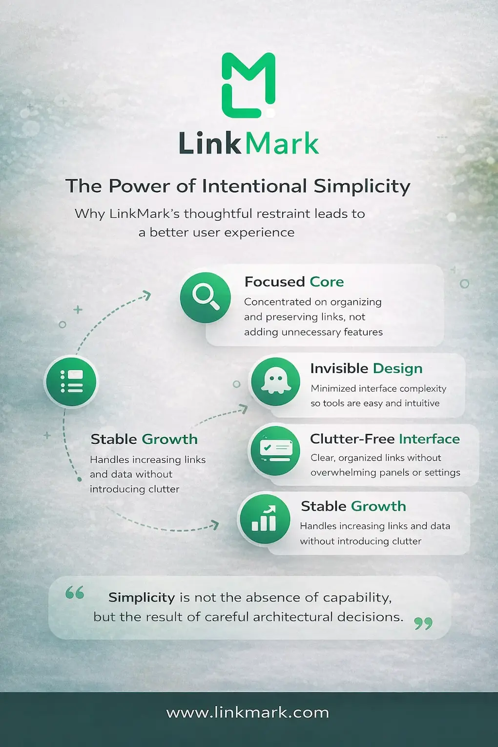
Simplicity Is a Structural Decision
True simplicity begins with architectural discipline. It requires clarity about what the tool is meant to do and, just as importantly, what it is not meant to do. Many digital tools evolve by reacting to user requests without reconsidering their structural integrity. The result is often feature accumulation without coherence. LinkMark avoids this pattern by maintaining a focused core: organizing and preserving links within a structured thinking environment.
This focus allows the system to remain stable even as usage grows. Rather than scattering options across multiple panels or overwhelming the user with configuration choices, the architecture supports clarity through constraint. Fewer visible elements do not mean fewer possibilities. They mean fewer distractions between intention and action.
The Role of Invisible Design
When a system feels intuitive, it usually means the architecture is doing its job quietly. Invisible design reduces the number of decisions a user must make. It removes unnecessary friction while preserving flexibility. LinkMark’s simplicity operates in this way. Instead of asking users to build complex structures manually, it provides a coherent environment where organization emerges naturally from use.
The architecture prioritizes recognition over recall. Instead of relying on memory to navigate layers of folders or configurations, the structure supports visibility and continuity. This reduces cognitive effort without drawing attention to the mechanism itself. What remains is a calm, stable interface that feels predictable over time.
Growth Without Overgrowth
One of the most difficult challenges in product design is supporting growth without introducing clutter. As more links are added, as more projects evolve, the system must remain clear. Many tools become heavier with increased usage. Lists expand endlessly. Categories multiply. Retrieval becomes slower and less certain.
LinkMark’s architectural strength lies in how it manages scale. Instead of allowing information to expand in chaotic layers, the structure absorbs growth. The environment remains consistent whether it holds ten links or hundreds. This consistency preserves user confidence. The system feels stable even as it evolves.
Why Restraint Creates Power
Restraint is rarely associated with power in digital tools. More options are often equated with more capability. However, disciplined restraint can create a stronger experience. By limiting unnecessary complexity, LinkMark protects clarity. The architecture ensures that each interaction serves a purpose rather than introducing decorative functionality.
This approach strengthens long-term usability. Users are not required to relearn the system as it grows. The underlying structure remains familiar, reducing the friction that often appears when tools attempt to scale through added features.
Read more: How to Use LinkMark to Organize Your Links Without Effort
Consistency as a Design Principle
Consistency is one of the least visible yet most impactful aspects of architecture. When a system behaves predictably, trust increases. Users do not hesitate before acting because they understand how the environment will respond. LinkMark’s simplicity is reinforced by this consistency. Navigation, organization, and retrieval follow clear internal logic that does not shift unexpectedly.
Over time, this predictability reduces mental strain. Instead of adjusting to new layouts or shifting structures, users interact with a stable foundation. Stability encourages deeper engagement because attention remains on the content rather than the tool.

Clarity as a Competitive Advantage
In a crowded digital landscape, clarity becomes a differentiator. Many platforms compete by offering more integrations, more customization, and more complexity. LinkMark differentiates itself by offering clarity as a core value. The architecture does not attempt to overwhelm. It aims to support thinking without interfering with it.
This design philosophy ensures that the tool complements workflows rather than dominating them. Simplicity becomes a form of respect for the user’s attention. It acknowledges that the goal is not to impress with features but to enable focus.
The Long-Term Impact of Architectural Integrity
Over time, architectural integrity compounds. A system built on clarity continues to feel light even as it grows. Users develop confidence because the structure does not betray them with sudden complexity. Each interaction reinforces stability rather than introducing doubt.
This long-term stability changes how a tool is perceived. It becomes part of a routine rather than a recurring problem to manage. The architecture fades into the background, allowing the user’s thinking to take center stage.
Conclusion
Simplicity is not accidental. It is the visible outcome of careful architectural decisions. Behind LinkMark’s calm interface lies a deliberate structure designed to preserve clarity as usage expands. By prioritizing focus, consistency, and disciplined growth, the system remains stable without sacrificing capability.
In a digital environment where complexity often masquerades as innovation, architectural restraint becomes a strength. LinkMark demonstrates that simplicity, when built on strong foundations, is not a limitation. It is a long-term advantage.